Policy view
Home > Using > Web User Interface > Views > Policy view
Contents
1 Overview
An policy is a "an instruction for the monitoring of a server for an event that could lead to loss of, or disruption to, an organisation's operations, services or functions". The policy view contains all policies and policy groups that are in an application. A policy can be viewed by clicking on the name of the policy.
The policy view is found by selecting the Events menu item.
2 Options
2.1 Global options
There are three global options available for the event view.
![]() Used to add/remove or change the column order. Click on this icon to display the Reorder Columns dialogue box to add, remove or reorder the event columns.
Used to add/remove or change the column order. Click on this icon to display the Reorder Columns dialogue box to add, remove or reorder the event columns.
![]() Used to switch the Last Occurred and First Occurred date/time fields between and fixed (e.g. dd/mm/yyyy time) and relative (e.g. 16 hours, 3 minutes)
Used to switch the Last Occurred and First Occurred date/time fields between and fixed (e.g. dd/mm/yyyy time) and relative (e.g. 16 hours, 3 minutes)
![]() Used to download the events that match the event filter selection criteria to your local computer.
Used to download the events that match the event filter selection criteria to your local computer.
2.2 Item options
There are no item options available for events.
2.3 Context options
There are no context options available for events.
3 Filters panel
Adjusting the filters allows you to change what is populated in the results pane. See event filters for a full description of what is available.
3.1 Hiding the filters panel
The filters panel can be hidden moving the slider ![]() to the left hand side. Once it is hidden it can be revealed by moving the slider to the right
to the left hand side. Once it is hidden it can be revealed by moving the slider to the right![]() .
.
3.2 Selecting a time period
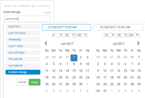
The time period that is being displayed can be changed using the date/time picker that is labelled Time Range. Click in the text box to expand the the selection criteria for the time range. Move your mouse over the desired time range and click on it to apply. If a custom time range is desired click on Custom Range and either select the desired time range or type it into the fields at the top and click on the ![]() button
button
Available date ranges
- Last hour: Selects the last 60 minutes of data. The data will appear in minute time increments.
- Last 24 hours: Selects the last 24 hours of data. The data will appear in 5 minute time increments.
- Last 7 days: Selects the last 7 days of data. The data will appear in hourly time increments.
- Last 30 days: Selects the last 30 days of data. The data will appear in daily time increments.
- This month: Selects the current calendar month of data. The data will appear anywhere from in 5 minute to daily increments depending upon how early in the month the dashboard is viewed.
- Last month: Selects the last calendar month of data. The data will appear in daily time increments.
- Custom range: Selects time range that can can be as short or as long as desired. The data will appear in time increments that match the selected range.
