Difference between revisions of "Action view"
m |
m |
||
| Line 1: | Line 1: | ||
| − | [[Welcome_to_Veloopti_help|Home]] > [[:Category:Using|Using]] > [[:Category: | + | [[Welcome_to_Veloopti_help|Home]] > [[:Category:Using|Using]] > [[:Category:Web_User_Interface|Web User Interface]] > [[:Category:Views|Views]] > [[Action_view|Action view]] |
---- | ---- | ||
Latest revision as of 20:04, 26 September 2019
Home > Using > Web User Interface > Views > Action view
Contents
1 Overview
An action is a "a executable binary or script that can be run locally on a node that has a Veloopti agent installed". The action page contains all collective actions in an application and the groups that they reside in. An actions can be viewed by clicking on the action name in the list.
The Actions page is located by
- Open an application (either by selecting your favorite or clicking the menu item Applications and clicking on an application name.
- select action from the application configuration categories drop down menu.
2 Options
2.1 View options
There are two view options available for the action view.
| |
Used to view all of the actions in list form | |
| |
Used to view the action groups and actions that they contain. |
2.2 Global options
2.2.1 Item view
There are two global options available for the action group view.
2.2.2 Group view
There is one global option available for the action view.
2.3 Item options
2.3.1 Item view
There are five item options available for actions.
2.3.2 Group view
There are three item options available for action groups.
| 20px | Link/Unlink to Node Group | Creates an association from the action group to a node group |
| |
'Rename | Prompts you to rename the group. |
| |
Delete | Removes all associations of the actions to the action group and removes it from your organisation. No actions are deleted in this process. |
2.4 Context options
2.4.1 Group view
There are three item options available for action groups.
| 20px | Link/Unlink to Node Group | Creates an association from the action group to a node group |
| |
'Rename | Prompts you to rename the group. |
| |
Delete | Removes all associations of the actions to the action group and removes it from your organisation. No actions are deleted in this process. |
There are three item options available for action groups.
3 Filters panel
Adjusting the filters allows you to change the level of detail that is populated in the results pane. See event filters for a full description of what is available.
3.1 Hiding the filters panel
The filters panel can be hidden moving the slider ![]() to the left hand side. Once it is hidden it can be revealed by moving the slider to the right
to the left hand side. Once it is hidden it can be revealed by moving the slider to the right![]() .
.
3.2 Selecting a time period
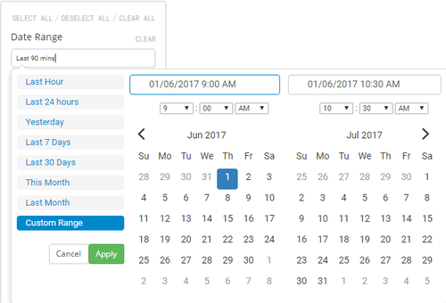
The time period that is being displayed can be changed using the date/time picker that is labelled Time Range. Click in the text box to expand the the selection criteria for the time range. Move your mouse over the desired time range and click on it to apply. If a custom time range is desired click on Custom Range and either select the desired time range or type it into the fields at the top and click on the ![]() button
button
Available date ranges
- Last hour: Selects the last 60 minutes of data. The data will appear in minute time increments.
- Last 24 hours: Selects the last 24 hours of data. The data will appear in 5 minute time increments.
- Last 7 days: Selects the last 7 days of data. The data will appear in hourly time increments.
- Last 30 days: Selects the last 30 days of data. The data will appear in daily time increments.
- This month: Selects the current calendar month of data. The data will appear anywhere from in 5 minute to daily increments depending upon how early in the month the dashboard is viewed.
- Last month: Selects the last calendar month of data. The data will appear in daily time increments.
- Custom range: Selects time range that can can be as short or as long as desired. The data will appear in time increments that match the selected range.
