1 Overview
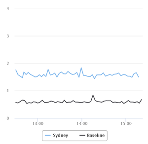
Dashboards are the primary way of viewing the metrics and events Veloopti has collected from your IT Infrastructure. Dashboards are composed of multiple elements:
- Graphs
- Event table
- Filters panel
The Dashboard page is found by selecting the Dashboards menu item.
2 Graphs
A Graph is a graphical representation of data, in which "the data is represented by symbols, such as bars in a bar chart, lines in a line chart, or slices in a pie chart". Veloopti can store large amounts of data and displaying them in a graph is the way that it is easy for you to interpret the data with a glance. Clicking on the label at the bottom of a graph will hide or reveal the line of metrics
2.1 Event numbers on graphs
Events that occur for a metric are noted with the number ![]() occurring.
occurring.
3 Event table
An Event is a detectable or discernible occurrence that has significance for the management of the IT Infrastructure. The event table contains Events that are related to the graphs.
Viewing an event
Events can be viewed by clicking on the event
Changing the Event Browser column order
To change the Event Browser columns navigate to the event browser and change the columns using the ![]() icon.
icon.
4 Options
4.1 Global options
There are no global options available for the dashboard view.
4.2 View options
There is one view options available for the dashboard view.
![]() or
or ![]() Used to change the dashboard view between group view and list view.
Used to change the dashboard view between group view and list view.
4.3 Item options
There is one item option available for dashboards.
20px Used to add a dashboard to your favourites.
4.4 Context options
There are no context options available for dashboards.
5 Filters panel
Adjusting the filters allows you to change what is populated in the results pane. See dashboard filters for a full description of what is available.
5.1 Hiding the filters panel
The filters panel can be hidden moving the slider ![]() to the left hand side. Once it is hidden it can be revealed by moving the slider to the right
to the left hand side. Once it is hidden it can be revealed by moving the slider to the right![]() .
.
5.2 Selecting a time period
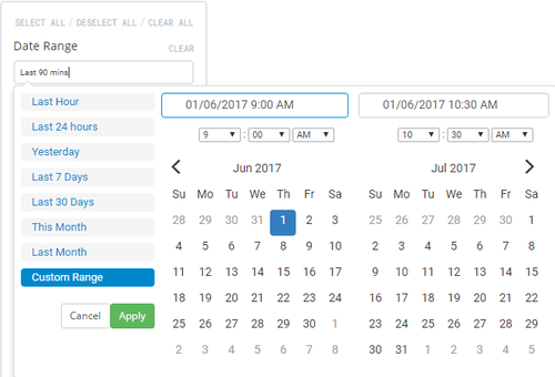
The time period that is being displayed can be changed using the date/time picker that is labelled Time Range. Click in the text box to expand the the selection criteria for the time range. Move your mouse over the desired time range and click on it to apply. If a custom time range is desired click on Custom Range and either select the desired time range or type it into the fields at the top and click on the ![]() button
button
Available date ranges
- Last hour: Selects the last 60 minutes of data. The data will appear in minute time increments.
- Last 24 hours: Selects the last 24 hours of data. The data will appear in 5 minute time increments.
- Last 7 days: Selects the last 7 days of data. The data will appear in hourly time increments.
- Last 30 days: Selects the last 30 days of data. The data will appear in daily time increments.
- This month: Selects the current calendar month of data. The data will appear anywhere from in 5 minute to daily increments depending upon how early in the month the dashboard is viewed.
- Last month: Selects the last calendar month of data. The data will appear in daily time increments.
- Custom range: Selects time range that can can be as short or as long as desired. The data will appear in time increments that match the selected range.
- Special ranges: Some Dashboards are pre populated with a time range that is not available by selection. If you have selected a range of time and want to go back to the non standard time range then refresh the browser.

