Style guide

From Veloopti Help
Jump to: navigation, search

1 Overview

This style guide provides the guidelines to which additions and changes to this Veloopti help should adhere to. This is to ensure that there is consistency within the many articles and enforces our best practice in usage, language and visual composition. Write to the user You should, or You will have to are acceptable. Don't talk about the user in the third person Tell the user what to do they are not left wondering what they should do

2 Language

Australian English is used throughout the site.

2.1 Perspective

You should write in the second person. Writing in the second person requires use of the pronouns you, your, and yours. This point of view is commonly used to address the audience in technical writing and as such you should use it here also.

Here are examples of writing in second person:

  1. To make lemonade, you add the juice of lemons to water and sugar;
  2. To calculate the floor area of a room, multiply the width by the length;
  3. To add oil to your car engine, unscrew the cap, place a funnel inside, and slowly add the oil.

2.2 Capitalisation

Capitalisation should only be used when it increases the meaning that is held in the words. For the most part don't capitalise unless it helps to clear up any ambiguity.

2.3 Bold

Bold should be used rather than the capitalisation of a name/title. Instead of writing "Action Group" it should be written action group. This allows for the item being addressed to remain lower case and to also draw the eye to what it is.

2.4 Italics

Use italics for the common things that it is used for: i.e. the usual things; and the last item with an in-line lists.

3 Templates

The fllowing templates are used and should be used.

3.1 Main article

When referring to another article use the 'Main' template. This is done by using the following code:

:''{{TNT|Main|Page name, i.e. Configuring user roles}}''

3.2 See also

When directing a user to look at anther article then use the 'See also' template. This is done by using the following code:

:''{{See also|Page name, i.e. Configuring user roles}}''

4 Items

4.1 Buttons

Buttons should have the picture copied from the Veloopti website and referenced, e.g. Click the Update profile button.png button to update your profile.

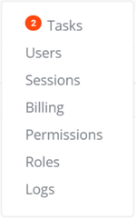
4.2 Menu items

Menu items are selected and not clicked so tell people to select the Dashboard menu item, not click it. The item that is selected should be bolded, e.g. Select the Dashboards menu item to view the available dashboards.

Menu sub-items are menu items that are lower than the main menu item. They should be referred to as: Select the Dashboards -> favourites menu item to select your favourite dashboard.

4.3 Keyboard

When telling the user to use the keyboard, use the {{Key press}} template e.g. {{Key press|Enter}} for Enter.

4.4 Code

Code should be written surrounded in <code> and </code>; thus in the form: <code>question = /(bb|[^b]{2})/</code>.

This results in the following output: question = /(bb|[^b]{2})/

4.5 Pseudocode

Pseudocode should be written indented with spaces. The first line should have one space and subsequent levels of indentation should have five spaces. To join together two pieces of pseudocode into a single block place a space at the beginning of the empty line.

IF You are feeling bold THEN
    Go parachuting
ELSE
    IF you are feeling a little bold THEN
         Go canyoning
    ELSE
    Take a walk to the city
END IF


IF you are hungry THEN
    Go eat some food
END IF

4.6 console output

Console output should be placed in a black box to simulate what it looks like in a terminal session or command prompt. Separate the text across multiple lines if multiple lines of output are displayed. Console output should be surrounded by <pre"> </pre"> thus the form:

  <pre style="color: silver; background: black;">This text should look like a command line terminal output
  Spread it over multiple lines if you like</pre>

This results in the following output:

This text looks like a command line terminal output
Spread it over multiple lines if you like

4.7 Warning boxes

The Warning.png icon should be used when you want to alert the reader to something. Also make sure you put five spaces and then Note: in all bold (one day I'll get that turned into a template). :[[file:Warning.png|20px]] &#160; &#160; &#160; &#160; &#160; &#160; '''Note:'''

Warning.png           Note: Do remember to indent it.

5 Page names

Pages are always named in the singular format. This is to assist with when you search as t makes it easier to find things. For instance; if you type 'event' into the search at the top of the page it will bring up: 'event filters' 'event lifecycle' etc. We don't want the user to type 'events' and some of the help pages disappear because there is 'events filters' and 'event lifecycle'.

6 Categories

Categories are used to make things easier to find. There are two different type of categories in the Veloopti Wiki:Category tree; and Category types.

6.1 Category names

Categories are usually named in the plural unless it makes sense to have them in the singular. THhe only known exception thus far is 'billing' and it sounds weird to have a category of 'billings'.

6.2 Category tree

The category tree is used to contain the articles into a tree structure. The tree structure is designed to make things easy to find. The current category structure is below.


Warning.png             Note: The above categories are entirely dynamic. Sometimes they are manually entered and therefore can appear in a different order.

7 Joining Categories and pages together

The categories spread across multiple category trees and are used to pull things together. This is taken from from Categories - contents. Any changes should be made in both places.

Category type Main page for category type
Actions Actions
Agents Agent
Billing Billing
Dashboards Dashboards
Events Event
Logs Log
Metrics Metric
Nodes Node
Notifications Notification
Organisations Organisation
Outages Outage
Policies Policy
Tasks Task
Users User